Hi, we're designers, dreamers, and thinkers. We design brands to be noticed, websites and apps to be used, and products to be loved.
GET IN TOUCH
Hi, we're designers, dreamers, and thinkers. We design brands to be noticed, websites and apps to be used, and products to be loved.
GET IN TOUCH
We pose the right questions so we understand your challenge. That makes our approach more intuitive and harmonized, and it makes your project management much easier.

Design is not just talent. It’s the feelings, the heart, and the knowledge we pour into developing your project. It’s the way we create works of art that have won awards like a Red Dot or the CES Innovation Award.

Our approach is appreciated by corporate customers as well as start-ups. What matters to them is personal communication and solutions that aren't just innovative but also affordable.

___
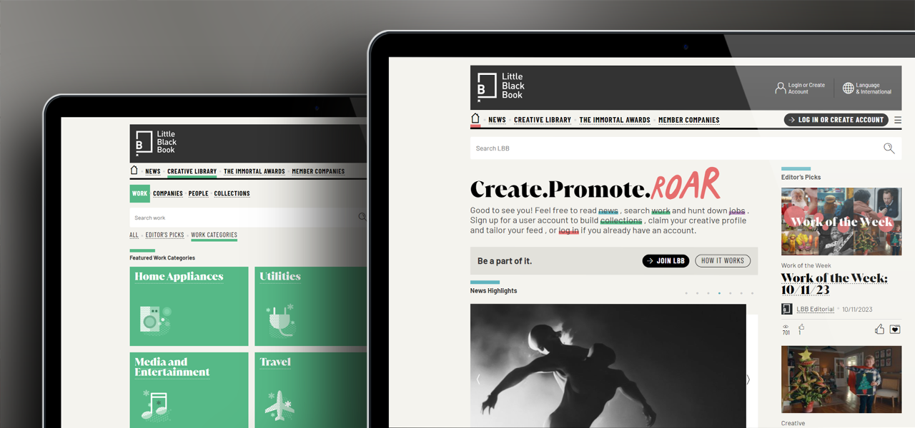
UX/UI design, illustrations, icon set
The Little Black Book – LBB Online – is the global online community of companies and people working in the advertising industry. Not only it is one of the industry’s leading news media websites, but it also features an extensive library of creative work, companies, and people. LBB even runs its own award show – The Immortal Awards. The maze of different content required us to work on a complex UX study, which we upgraded with a bit retro-looking, yet clean design, with a large illustration set celebrating the good old printed newspaper.
C: Little Black Book
United Kingdom
___
Product design, branding, character design
The kind black dragon with his broken English is a leading character of the city of Ljubljana souvenir series, including a wide range of products like T-shirts, temporary tattoos, toys, drinks, postcards, and more.
Awards: Award of Excellence, Biennale of Visual Communication, Slovenia
C: Kaaita / Kontrastika
Slovenia
___
User experience and user interface design, content creation, branding
A balanced lifestyle is made up by a series of daily events like meeting with friends, having meals, and taking care of yourself, your family, and your home. Skipping these activities might lead to addictions, burnout, or anxiety. That's why we built the My Craziness Index app following methodology developed by renowned psychotherapists. The app allows users to keep track of their activities and shows their progress on the simple “craziness index” chart.
C: Kontrastika
Slovenia

___
Logo and brand identity design
Mare Marko is a chain of fish shops in Slovenia. Their fish is famous for being brought to the table almost directly from the sea. To emphasize this feature we created a fisherman, Mare , offering his catch to you.
C: Bar Mar
Slovenia

___
Logo and brand identity design, branding, packaging design
The Aikon Derma Systems skin-care product line consists of a wide range of products requiring strategic analysis of complex layers of information. Each piece of information was therefore turned into an illustration, color coding, or description – all following the aim of making the choice as easy for the user as possible.
Awards: Award of Excellence, Biennale of Visual Communication, Slovenia
C: BeAikon
Slovenia
___
Product design, packaging design, product graphics, lifestyle photography
Eco-friendly, lavender fragrant CopaCopa slippers, the DingDong indoor swing, and a Hendee bag made from recycled paper are the result of close collaboration with our client and users, as well as a lengthy discussion, sketching, and prototyping phase. After a couple years as our client Kaaita’s customers seem to truly adore their innovative product line.
Awards: BIO gold medal, Biennale of Industrial Design (for CopaCopa slippers), Slovenia
C: Kaaita
Slovenia
___
Brand identity, user-interface design
Joan is a meeting room assistant. This e-paper based tablet is installed easily near a meeting room door, from where its interface, which we designed, integrates with the office’s calendar software. Joan also works as a digital sign – you know, a “vacant” or “taken” thing.
Awards: Red Dot Design Award, Germany, CES Innovation Award, USA, IoT – Internet of Things, USA, Brumen Award, Slovenia
C: Visionect
Slovenia
For Joan's product website we designed an animated video, showing that your company absolutely needs Joan, unless it wants to build a new skyscraper just to book enough meeting rooms.
___
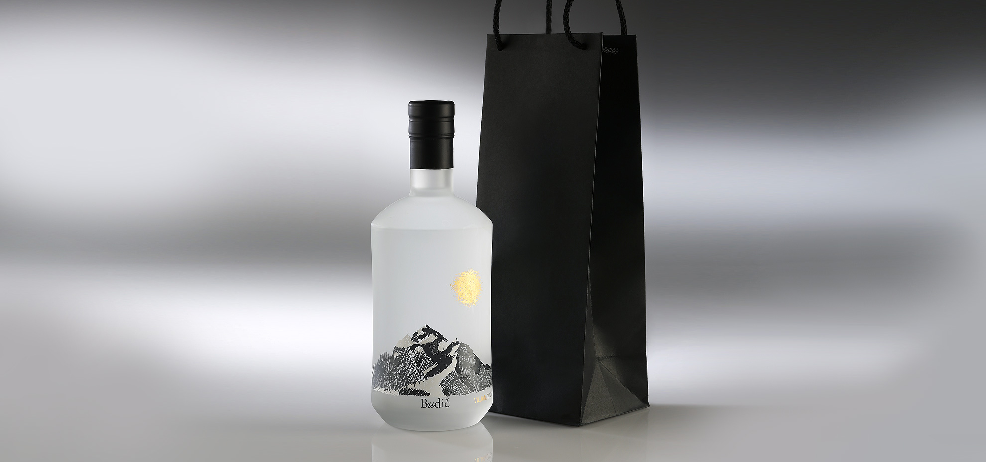
Brand identity design, label design, packaging design
Budič premium spirits, have – according to experts – a full-flavored taste that is full of surprises. Its why also the packaging has been designed that way, to work as original, premium and to suggest an extraordinary Budič experience.
C: Budič Spirits
Slovenia
___
UX/UI Design
Our UX/UI experience goes far beyond simple websites; in fact, the Slovenian eGovernment might be the best case to prove it. The state portal unifies services like claiming child support, reviewing property or vehicle ownership, as well as simple articles explaining e.g. how to get married or build a house – as the modules of the same user interface.
C: Government of the Republic of Slovenia /SRC
Slovenia

___
Brand and corporate identity, app user interface-design, brochure design.
The orca, the queen of the northern oceans, might be the perfect metaphor for heating systems that work flawlessly even under Arctic conditions. The Orca Energy brand was developed from scratch, growing over the years to become one of the industry's most recognizable ones.
C: Orca Energija
Slovenia
___
Costume design
It is a demanding creative experience to connect movement, music, and light with clothing, particularly when it comes to kids. That's why we enjoyed exploring the theme of “water” and “stories” the year later, when designing costumes for the annual Conservatory of Music and Ballet Ljubljana show.
C: Conservatory of Music and Ballet Ljubljana
Slovenia
___
User-interface design, web design, explainer video production
Pinegrow is a visual website design and front-end development tool. In close collaboration with its developers we developed a flexible interface featuring a bunch of views, tabs, movable panels, and a set of 300+ custom designed icons. As version 4 has been launched, we also designed its product website together with an explainer video.
C: Pinegrow
Singapore
___
Brand identity design, packaging design
Yanee is an organic skin care products line that comes is three different scents. Sensitive illustrations and a typographic layout were developed so as to take design for this kind of cosmetics to the next level. As the product line has already been launched, it is already enjoying great success on the market.
C: Janežič Farm
Slovenia

___
Crowdfunding platform design, brand identity design, animated video production
TravelStarter was a worldwide crowdfunding platform for tourism. As it was the first such platform, we had to invent a whole new UX/UI concept when we designed this revolutionary service.
C: TravelStarter
United States

Along with the TravelStarter website and logo we also produced an animated explainer video, featuring Joe the traveler and three people in Paris who need his funding for their projects.
___
Brand and corporate identity design, web design
We consider transport, particularly in the food industry, as an extremely responsible business and this was our design concept, rather than playing around with car-racing imagery. That's why we built a visual identity based on a simple logo borrowing two well-known symbols, which speak for themselves: “liquid to the location".
C: Forbiz
Slovenia
___
Crowdfunding platform design, brand identity design, animated video production
The Squareknot platform was an innovative crowdfunding concept, combining equity, loans, and rewards. It was the first company of its kind in Scotland (and later in Australia) and a great experience in designing all possible user paths and actions when submitting pitches, as well when funding them.
C: Squareknot Limited
United Kingdom

Part of the whole Squareknot identity was an animated explainer video about Ann, who needs funding for her bakery where Squareknot funding was basically the only option.